A landing page can be one of the most powerful tools in your marketing toolkit when done right. It’s not just a digital placeholder or a generic web page. A well-crafted landing page has one primary goal: to convert visitors into leads, customers, or subscribers. And when it’s designed with intention, it works.
This guide breaks down what a landing page is, how it’s different from a typical website, the key elements that make it effective, and step-by-step tips to help you build one that delivers results.
What Is a Landing Page?
A landing page is a standalone page created for a specific marketing goal, usually to get a visitor to take one action, like signing up, downloading something, or making a purchase.
Unlike your homepage or services page, a landing page is focused. There are no distractions, no menus, and no multiple paths. Just one clear message and one clear action. That’s what makes it so effective.
Marketers typically use landing pages in paid ad campaigns, email promotions, product launches, or lead generation campaigns—any situation where you want a visitor to do one thing, fast.
You may also like this one: How to Write Good Blog Titles that Attract and Excite Your Audience
Landing Page vs. Website: What’s the Difference?
If you’re wondering whether you need a landing page when you already have a website, here’s a simple way to think about it:
- Purpose: A website showcases your brand and offers multiple things. A landing page drives one action.
- Navigation: Websites usually include menus and links. Landing pages limit navigation to reduce distractions.
- Content: Websites are broader. Landing pages are specific to one campaign or offer.
- Audience: Websites attract general visitors. Landing pages are built for targeted traffic from ads, emails, or promotions.
Key Components of a High-Converting Landing Page
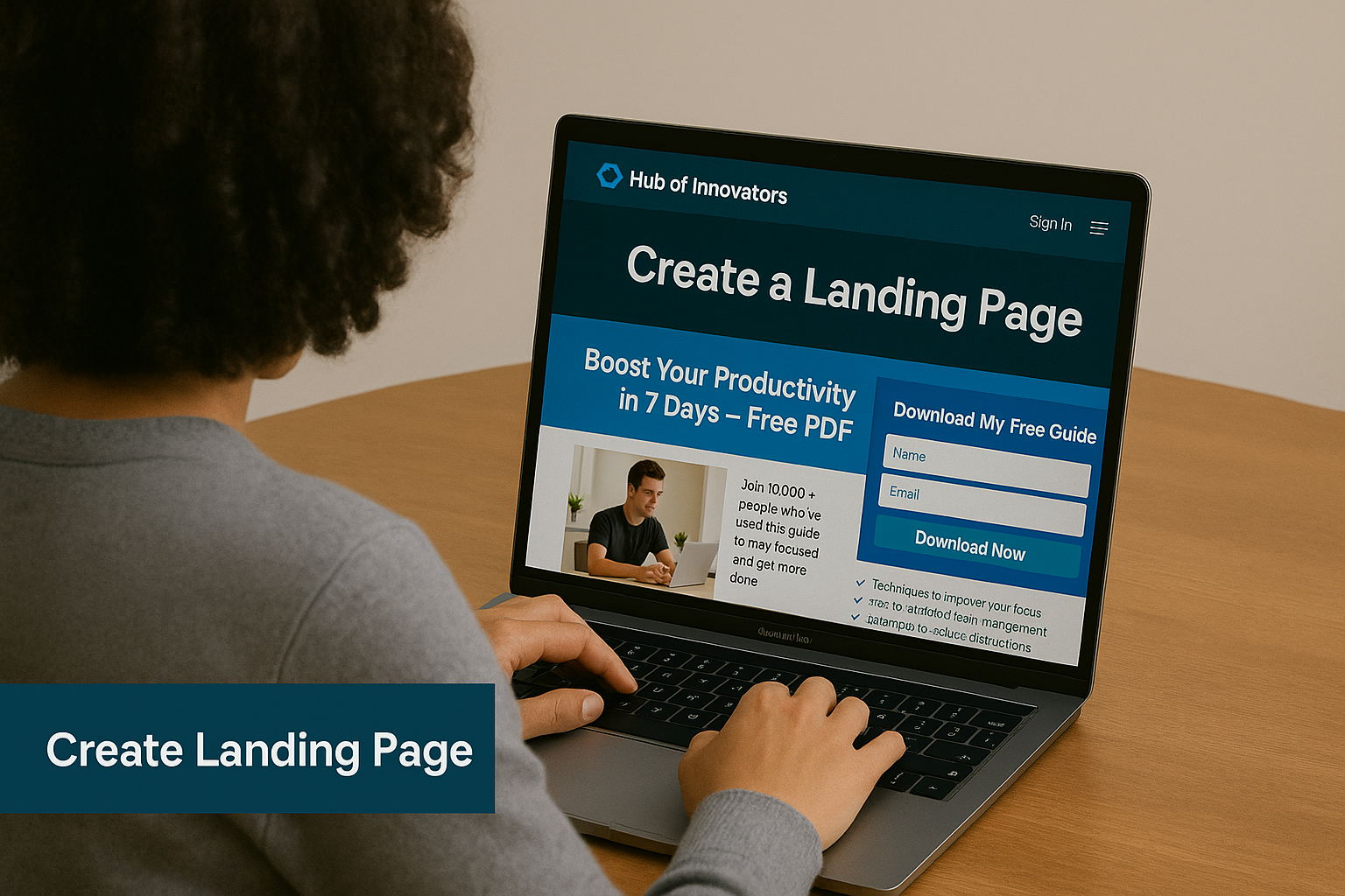
Headline
Your headline should make it clear what you’re offering and why it matters. It’s the first impression, so it needs to grab attention fast.
- Example: “Boost Your Productivity in 7 Days – Free PDF Guide”
Subheadline
A short, supportive line that adds context or reinforces the benefit.
- Example: “Join 10,000+ people who’ve used this guide to stay focused and get more done.”
Visuals
Use images or videos to support your message. For a product, show it in use. For a service, show the result it creates.
Benefits-Focused Copy
Instead of listing features, talk about what your audience will gain. Benefits speak directly to pain points and desired outcomes.

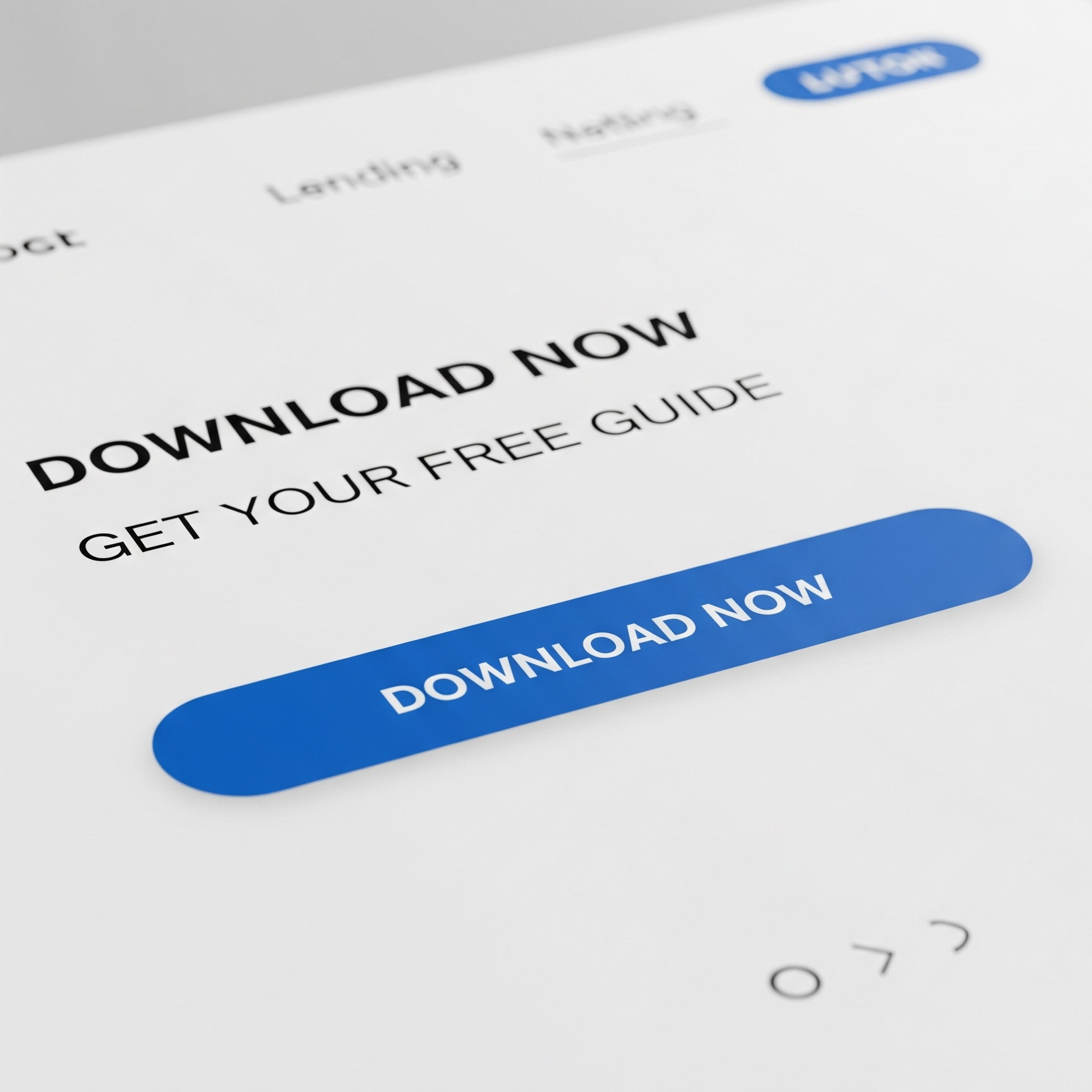
Call-to-Action (CTA)
A clear, standout button that tells the visitor exactly what to do.
- Example: “Download My Free Guide” or “Start Your Free Trial”
Form or Action Area
If you’re collecting leads, keep your form short. Just ask for the information you need.
Trust Elements
These include testimonials, customer reviews, security badges, or brand logos. They reduce doubt and build confidence.
How to Create a Landing Page Step-by-Step
1. Start With a Clear Purpose
Before you open any design tool or write a single line of text, get clear on what your landing page is meant to do. Ask yourself:
- Are you promoting a new product?
- Collecting email subscribers?
- Offering a free resource?
- Booking consultations?
Everything that follows—from the headline to the design—should revolve around this one core objective. If your page tries to do too many things at once, it’ll do none of them well.

2. Craft a Compelling Headline
Your headline is the first thing visitors will see, and in most cases, it determines whether they’ll keep reading or hit the back button. A good headline is specific, benefit-driven, and instantly makes the visitor feel like they’re in the right place.
These two examples:
❌ “Welcome to Our Website”
✅ “Get 50% Off Your First Order – Today Only!”
The second headline is clear, relevant, and gives people a reason to stay. It also creates a sense of urgency, which brings us to our next point.
3. Use Strong Visual Hierarchy
A well-designed landing page naturally guides the visitor’s eyes from one section to the next. This means using:
- Clear headings and subheadings
- Short paragraphs and bullet points
- Contrasting colors for CTAs (calls-to-action)
- Enough white space so nothing feels cluttered
Your most important content—like the value proposition and CTA—should be visible above the fold (the part of the page that shows without scrolling).
4. Focus on the Benefits, Not Just Features
Don’t just list what your product or service does. Tell visitors what’s in it for them.
Let’s say you’re offering an online course. Instead of:
“Includes 10 video lessons and 3 downloadable PDFs.”
Try:
“Master the basics in just 7 days—with bite-sized lessons and ready-to-use templates to help you apply what you learn instantly.”
Benefits speak to outcomes and make people visualize the value they’ll get.
5. Add Trust Elements
People are naturally skeptical online. Your job is to lower that skepticism with proof and reassurance. Here are a few trust-builders to include:
- Testimonials from real customers
- Logos of well-known clients or publications
- Security badges (especially if you’re collecting data or selling something)
- Social proof like reviews or user stats (“Over 10,000 downloads”)
Even a photo of a real person or team can humanize your brand and build confidence.
6. Create a Call-to-Action (CTA)
Your CTA is the most important button on the page. It tells your visitor exactly what to do next. And it should be:
- Action-oriented: Use verbs like “Download,” “Get,” “Start,” or “Join”
- Benefit-driven: Remind them what they’re getting (“Get My Free eBook” vs. just “Submit”)
- Visible: Use a contrasting color so it stands out and repeat it throughout the page
Also, keep forms short. If all you need is an email address, don’t ask for name, phone number, and job title too.
7. Optimize for Mobile
More than half of your visitors are likely viewing your page on a phone. If your landing page isn’t mobile-friendly, you’re losing leads. Make sure:
- Text is readable without zooming
- Images load quickly
- Buttons are big enough to tap
- Nothing breaks or misaligns on smaller screens
Test your page on multiple devices before launching.
8. Test and Improve
No landing page is perfect from day one. That’s why testing is essential. A/B testing lets you compare two versions of a page to see which performs better. You can test:
- Different headlines
- CTA button colors or text
- Testimonials vs. no testimonials
- Long form vs. short form
Use tools like Google Optimize, Unbounce, or Hotjar to track behavior and conversions. Then use what you learn to refine the page.
Bonus Tips
- Keep load times fast.
- Match your landing page design and message to the ad or email that sent users there.
- Always preview how your page looks on both desktop and mobile.
- Don’t forget to say thank you after users convert. Redirect them to a thank-you page or deliver the promised resource right away.
Conclusion
Landing pages are more than just digital flyers. They’re powerful conversion tools. When you focus on a clear goal, remove distractions, and speak directly to your audience’s needs, you create an experience that encourages action.
Whether you’re collecting leads, launching a new product, or promoting an event, a well-built landing page can do the heavy lifting for you.